FAQ
You can set the location of your widgets on different screen sizes. You can have separate settings for desktop and mobile.
ConvKit shows the widgets in a defined position, that can be changed on desktop and mobile versions. Before setting the positions, it is helpful to check out your website design and choose a position where the widget won't cover any important content. The most popular positions are the low left and right corners, and the middle.
On the different screen types, you can choose to show widgets or not show them at all. This is very useful because if you have a campaign that has a widget optimized to a desktop screen size, you can choose that on mobile it won't be shown. Many times, a widget can be used on both screen sizes, so you can also set that widget to be shown in both.
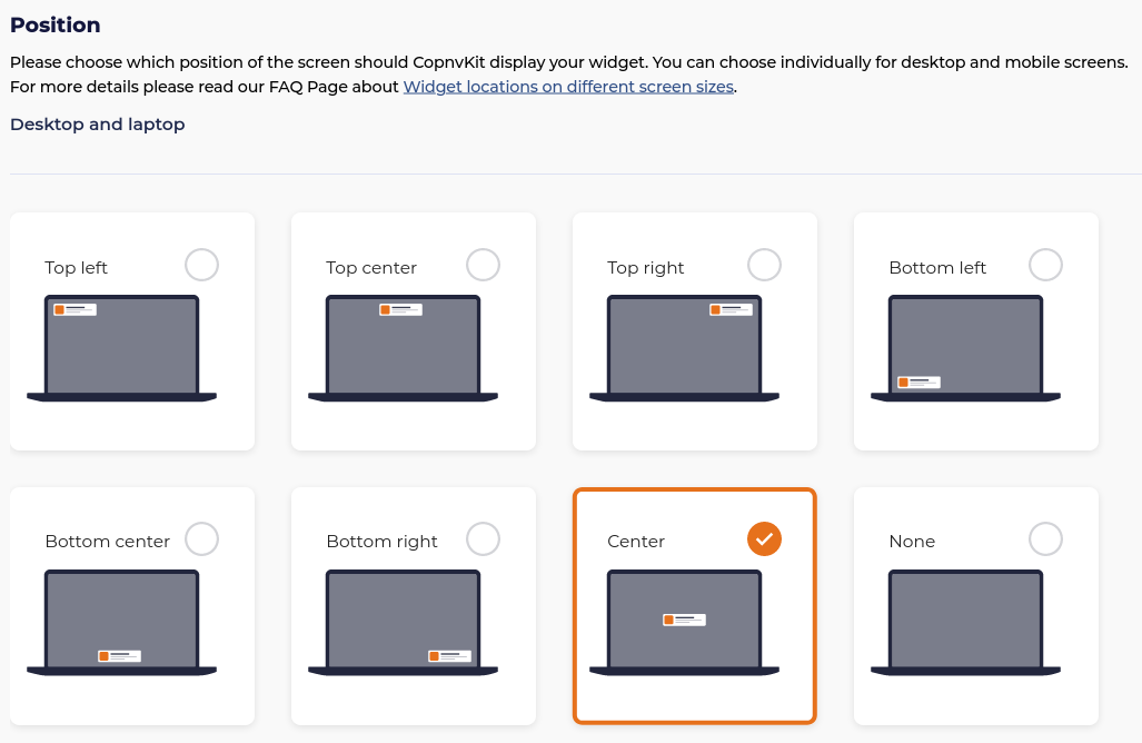
Available positions for desktop
- Top left corner of the screen
- Top middle of the screen
- Top right corner of the screen
- Middle of the screen
- Lower left corner
- Lower middle
- Lower right corner
- No show
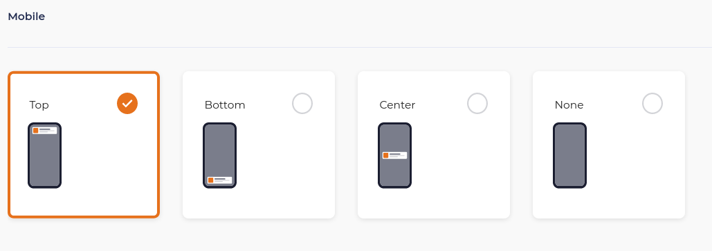
Available positions for mobile
- Top of the screen
- Middle of the screen
- Bottom of the screen
- No show


